Showing posts with label Ink. Show all posts

Monday, August 27, 2007

Laine's Designer Studio Class - Bits

On my last trip to Singapore, I finally managed to join a class at Laine's Papeterie for the first time. It was their Designer Studio Class and was entitled BITS. For the price of $58, you get enough class materials for two LOs. The class moved at a real fast pace and I was hard pressed to keep up with the instructions being given out by Betty. The good thing was that it was the last class of the month and there were only 3 people in it. So there was plenty of space to spread your stuff around cos as most people who've been to Laine's know, their classroom is pretty small.

I eventually had to leave with one LO about half finished and the second with only the basics completed. I had a great time though and learnt a lot. The class, in line with its title, BITS, teaches you to use bits of everything. From bits of paper and foam to bits of ribbon, cardstock and string.

The class sample LOs were designed by Sharon. I simply adore the first one below. The flower shapes' outlines were traced from Fancy Pants Big Board Chipboard and cut out by hand. I learnt what a running stitch is (ya my knowledge of sewing is sorely lacking) and for the first time inked the edges of my paper with...an inking sponge...LOL. I always inked the edges of my paper directly from the ink pad but am now converted to using a sponge. Ranger sells the sponge in one whole piece which you can cut up into little pieces. I bought a pack of cosmetic sponges from Watsons which work just as well.


Almost all the materials came with the class kit apart from the chipboard alphas which were my own. But Laine's class sample used the same exact one. I used a lot less embellishments but only cos my photo was wide, giving me less space for embellishments. I also used less ribbon on my LO but only because I like a cleaner look.
The title 'Its a boy' was my SIL2's suggestion and it suited the LO perfectly cos the photo is of Jay at about 2 months and everyone says he looks like a girl. And I gotta admit, when he was born, a lot of people said that same thing and when I show people this photo, they all think its a baby girl. Eeps!! He's boy boy boy...just a bit of a pretty boy. LOL.


The second LO was much simpler. We used up one whole piece of cardstock by punching out circles and then overlaying them a la fishscale style. Love this effect. The green and yellow dots are punched out foam circles and these were painstakingly glued down with the help of MM tweezers and GLOO.

And this is the reason I love scrapbooking. I had completely forgotten that Ty used to love tearing up paper when he was about a year old until The Dude gave me these photos. We used to give him old newspapers and he would busy himself by tearing them up to shreds. It would keep him busy and out of mischief for at least half an hour. His hands got awfully dirty but for some moments of peace, it was worth it. I guess we were just lucky he was not in the habit of stuffing things down his mouth. It really makes me feel glad that I can scrapbook this little bit of history for Ty to see and read about when he's older. :-)

Friday, February 23, 2007

Rubber Stamping 101

Now I have to admit, I do not make a lot of projects with stamps and inks. I use my small collection of rubber stamps and ink pads sporadically. More often than not, my most active stamping period is the run up to christmas when I start to frantically hunt for and wrap prezzies while simultaneously making gift tags.

I like buying tools that can be used over and over again and rubber stamps are one of them. Unfortunately, I have found that rubber stamps can also be quite costly especially alphabet stamp sets. In the past, stamps are mounted on wood but nowadays you can get stamps mounted on clear acrylic, which makes the placement of the stamps so much more easier, or foam stamps mounted on foam pieces. I personally like Hero Arts for wood mounted stamps, Autumn Leaves for clear stamps which have to be mounted on acrylic blocks and Making Memories for foam stamps. You can get Hero Arts stamps from Creative Hands in Takashimaya, Singapore and Paper Arts in Hong Kong. Autumn Leaves clear stamps can be obtained online from Pictures 2 Pages in Singapore.


INKS

There are a variety of ink pads that are available and each of them allows you to create different effects/looks with the just one rubber stamp.


Dye Inks


I have several of the kaleidacolor ink pads as seen above (by Tsukineko). Got them from Creative Hands in Singapore. Each pad has 5 different individual colour pads mounted on a slider. With a simple push of the slider, the individual pads join together to make one large multi-coloured pad. Because dye ink is pretty fluid, it bleeds easily and the ink pad must be stored with the individual pads separated to avoid a mixing of the colours. I use this pads for making invitation cards and gift tags.

Dye based ink pads dry quickly and is not suitable for embossing work. They should also be stored upside down to allow the ink to move to the face of the ink pad.


Pigment Inks

Pigment ink pads are slow drying and good for embossing. The above Color It ink pad by Ranger Industries was my first ink pad ever. I bought silver and black from Inksquisite, the sister shop of Stamp It in Perth, Australia. I was recommended this particular pad as I wanted to to embossing for my church wedding invites. The Hubby and I made our own invites and bought all our supplies from Inksquisite. As first time embossers, the shop lady advised us to get a coloured pad as opposed to a clear embossing ink pad so that it would be easier for us to see the design we were embossing.

Pigment inks are rather thick and viscous and therefore not suitable for use on glossy paper. I didn't even dare to use it on vellum paper. Tsukineko makes all sorts of pigment ink pads with different uses.


Above is the Versamark Watermark ink pad. It is clear and when you stamp your image on dark coloured cardstock, it creates a watermark effect. You can also use it to create a resist image on paper, then dye or ink the paper. The dye or ink won't be absorbed into your stamped image making it stand out.


Opalite is another pigment ink pad which gives off a reflective effect. I have one Opalite pad but have not used it yet. Hehe.

The one type of ink pad that I do use quite often are the Versacolor and Versamagic pads. The Versacolor pads are the Tsukineko equivalent of Ranger's Color It pads and they look great when used on any color cardstock. Versamagic pads are a chalk pigment ink and it creates a chalky look without any of the chalky residue. I find that these pads don't work too well on dark cardstock though.


Solvent Inks

Solvent inks are permanent ink pads that can be stamped on anything from glass, wood, metal and leather. Refer to previous post 'Like Father Like Son' for more on this.


Distress Inks

Ranger Industries produce a great brand of distressing inks by Tim Holtz. I love these ink pads as they are fabulous for inking the edges of your paper. I have about 10 of this range in different colours. Other brands like Making Memories also make distressing ink.


Embossing

This is a fun way to play with stamping as it gives your stamped image a raised and embossed look. You need to use pigment inks to stamp your image or a clear embossing ink pad, then pour embossing powder (see below) over your stamped image and heat with a heat tool.


You can also get tinted Embossing ink pads so that it is easier for you to see your image when you pour the embossing powder.

If you don't own a heat tool, no worries. Heat your image over a toaster (the sort that pops up) or put it near an iron. The heat from the toaster and iron will melt the embossing powder and give you the embossed image. When the Hubby and I did our wedding invites, we used a toaster cos the heat tool was not within our budget at that time. :-) What you must NOT use is a hair dryer as it blows out a lot more air that is not hot enough to melt the powder. You're likely to blow away your embossing powder. Hee.

You can get embossing powder in all sorts of colours as well as clear ones. Usual embossing powder is made up of tiny grains that looks rather like fine salt. Then you get Ultra Thick Embossing Enamel ("UTEE") which is about the same thing except the grains look like rough salt. UTEE gives a thicker embossing effect and if you layer enough UTEE over an image, you can 'crack' the UTEE to give the image a crackle effect.


Cleaning your stamps

After using your rubber stamps, it is best to clean them to avoid a build up of ink. This is also to avoid a bleeding of colour when you use them on other ink pads. I use the Ranger Industries stamp cleaner (see below) bought in 2003 from Inksquisite. A bottle goes a long way unless you use your stamps all the time. I reckon my bottle is still about three quarters full.


My stamp cleaner has a sort of rough-ish pad on top. All you do is squeeze the bottle lightly while rubbing the rough pad over your stamp, then just dab your stamp clean with a paper towel or tissue. It is best to also rub the top of your cleaner with tissue to clean it as well.


Now you can get stamp cleaners in a spray bottle which you can just spray on your stamp. Or you can get the scrub-it pad below which goes with the spray cleaner which is scented. Nothing like Chanel No.5 though.


Clear stamps

The popular take on rubber stamping nowadays are unmounted clear acrylic rubber stamps. These are excellent as they are flat and hence easy to store (can use a file folder). And you can get mounting blocks with grid lines (Provo Craft) to help you place your stamps. Autumn Leaves do a great range of clear stamps.


And there it is...hopefully all you need to know to get you started on rubber stamping. Apologies if I have missed anything out and happy stamping!

Note: All photos were downloaded from the relevant websites (was too lazy to take photos of my supplies...much faster this way really and fun since I have been able to upload my photos onto blogger lately).

Thursday, February 22, 2007

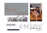
Like Father Like Son

Finally a proper father and son LO. I snapped this photo on the day we were doing a family photo shoot at home and was really pleased with this shot. I wanted to list out the similarities (and believe me there are many) between them, from the one single dimple on their right cheeks to how they sleep. What I was not able to say was the fact that both of them can sleep for hours on end!! Seriously!! Haha.


Materials:- Textured Cardstock: Bazill Basics Paper and DCWV; Patterned Paper: Junkitz; Vellum: Hot Off The press ('HOTP'); Die-cut arrow: 3 Bugs In A Rug; Alpha Stickers: American Crafts; Alpha Rub-ons and Dyed Tags: Making Memories; Woven Label 'Papa': Me And My Big Ideas ('MAMBI'); Buttons: Foof-A-La; Rubber Stamp: Hero Arts; Ink: Tim Holtz Distress Ink (Faded Jeans) and Staz On by Tsukineko; Pen: ZIG Writer, ZIG Opaque andUniball.


Yeah I finally got to use my stash of buttons by Foof-a-la. Didn't bother to stitch them on with floss or thread. Just stuck them on with glue dots. Even managed to use one of the buttons to record the date the photo was taken (see yellow button). I used a CD writing pen by Uniball because I knew for sure that the ink would not smear on the plastic button. Got this idea of writing on the button itself from my sis-in-law.


I knew I wanted my journaling strips to go on the side but did not want them to hide the pattern paper or stand out too much so I wrote on white vellum. Instead of using brads or eyelets as bullets for my strips, I used a rubber stamp with Staz On ink (see below) as I wasn't sure whether or not normal pigment ink would smear on vellum. Staz On ink pads are brilliant as they are permanent (it is solvent based so it does smell a bit) and smear-free on wood, metal, plastic, glass, etc. If you buy Staz On pads, make sure you also buy the Staz On Cleaner. Normal stamp cleaners will not work. I bought most of my Staz On ink pads and cleaner from Creative Hands (located at the 4th floor of Takashimaya, Singapore). I really wanted the black ink pad but Creative Hands never had any in stock whenever I was there. I finally found the black in Paper Arts (a dedicated rubber stamping shop in Hong Kong - if anyone is going, I have the address of the shop - worth a trip if you are into stamping).


The Junkitz paper I used came with a distressed effect which I love. The dyed tags I used as part of my title was a brand new buy from Shabby Chic (from the MM Fresh Anthology Collection). The idea for the use of the tags came right of the packaging, i.e. the sample page on the back of the packaging the tags came in. Hee. I wrote the 2nd word 'like' by hand. It was my attempt at cursive writing...haha I think fail lah!!

Sadly, after I had finished the layout, I found a pack of MM star buttons in reds and blues which would have been perfect for this LO. Sigh. That's why I try and organize my stash as best I can because 'Out of sight is out of mind' and I often have to spend ages going thru all my stash for embellishments just so I don't miss the rights ones.

Thursday, January 04, 2007

Happy Birthday!!

We celebrated the Hubby's birthday in November 2006 but I only completed the layout below in December. This is my first non-Ty 12x12 layout ever (finally eh) and I guess it is fitting that it is of the Hubby. The Hubby's friend has already commented on how come there are no pictures of the Hubby in any of the layouts that have been posted, so to Mr. B5000 here it finally is. :-)


Materials: Textured Cardstock: Bazzill Basics Paper; Patterned Paper: The Paper Patch; Snaps: Making Memories; Photo Corners: Heidi Swapp for Advantus; "Happy Birthday" laser-cut title: Go West Studios; "The Big 30" die-cut title: Quickutz (Marisa font); Clear Embossing Ink: Ranger; Ultra Thick Embossing Enamel: Suze Weinberg; Rubber stamp: Hero Arts; Watermark Ink: Versamark by Tsukineko.


This was the layout that I mentioned in my previous blog regarding embossing small die-cut letters with Ultra Thick Embossing Enamel (UTEE). The results for the title "The Big 30" came out really great (painstakingly done and at the expense of the tip of my Quikstik). It was really glossy because I had to re-do the UTEE several times to cover bald spots. The "Happy Birthday" title was less so because I only did one layer of UTEE and the cardstock colour was pale yellow.

This layout also represents my first time at tearing paper. Yes, I think the general reaction would be..."WHAT the 1st time??!!" but hey I am more of a neat freak when it comes to my pages. I think family will be glad to know that I am letting go of this anal nature and that I am beginning to realize that a little imperfection is actually ok. I actually enjoyed tearing paper.

Quick tip for the day: When you tear paper, make sure that you pull the paper directly towards your body and not sideways as you will get a better textured tear that way. (Credit for this tip goes to my cousin LJ who learnt it in her class at Laine's in Singapore - Cheers!).

By the way, do check out LJ's blog at http://jazzscraps.blogspot.com.

My mom saw this layout and was so enticed by the picture I took of the cake (mango flan from the Sheraton Hotel) to the point that she asked me to order the same cake for my own birthday just a week or so ago. I didn't mind as the cake is delicious!!

I'm not sure if you can tell from the picture above but I experimented with watermark stamping on the red paper. I used a rubber stamp and Versamark's Watermark Ink. The effect was rather good actually but I got overzealous in my stamping and the crazy randomness of it did not turn out so well...the messiness of the stamping did not appeal to me at all.

All in all, this is not one of my neatest layouts but at least it got done.

Friday, December 01, 2006

Layout sizes

Standard scrapbook pages come in 2 sizes. 12x12 and 8.5x11 (which is slightly smaller than an A4 sheet of paper). Of course you can get many different sized albums these days in sizes like 9x9, 8x8 and 6x6 albums plus many more different sizes. The more affordable and widely available 12x12 albums are from Making Memories and they come in various colours in a linen or faux leather finish.

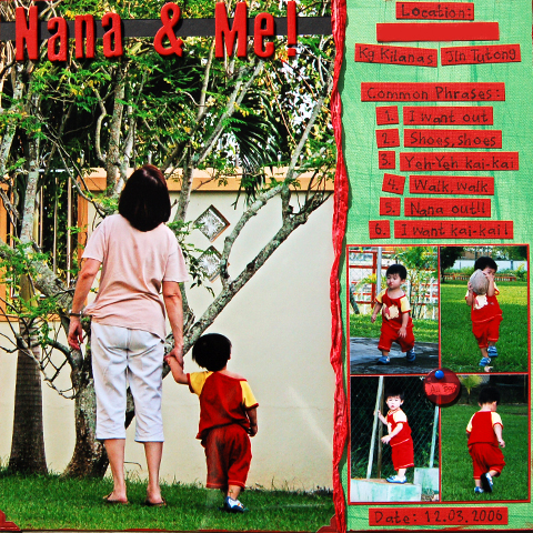
It is advisable to not layer too much paper and/or cardstock on the edges of your layouts as you may find it difficult to get your pages to fit into your page protector. I have that problem with the Nana & Me layout below. I placed my photo and patterned paper flush on the edge of my cardstock base thereby resulting in thick edges. So now i find it hard to get my page to fit in the plastic page protectors of the album and even more so if i try and fit a second layout on the other side of the page protector.

Colorbok produces albums called the The Perfect Scrapbook Album and Making Memories used to produce the Perfect Fit Albums. There are also other brands that advertise themselves as being the perfect fit for 12x12 pages so i gather the problem i have of trying to fit my thick-ish page into my album is a common occurrence. I have the Colorbok album but have not used it yet so whether or not it is true to its calling card, that i do not know.


This is the Colorbok Perfect Scrapbook Album, called as such as they claim that there is no need to trim your pages to get them to fit nicely.


I am using a Making Memories 12x12 album for Ty's pages (see above - blue linen with label holder). And when i saw the photo of my Mum and Ty holding hands, I immediately knew that the photo had to be enlarged to the maximum. I enlarged the photo to an 8x12 in order to fill the entire length of the page and put my journalling strips on the other side. The 4 little pictures at the bottom were a last minute decision and only because I couldn't decide on a space filler for that spot.

You might notice that the second cardstock strip on the layout is blank. The Hubby blanked it out as it had my parent's address on it. I didn't even know he did it till after I posted this.


Materials: Textured Cardstock: Making Memories and Bazill Basics Paper; Patterned Paper: Junkitz; Twistel and Acrylic Paint: Making Memories; Chipboard Alphabet: Heidi Swapp for Advantus; Photo Corners: Chatterbox; Tag and Brad: Queen & Co.; Alphabet Rubber Stamps: Hero Arts; Pigment Ink: Ranger.

Thursday, November 30, 2006

Uh Oh Here Comes Trouble

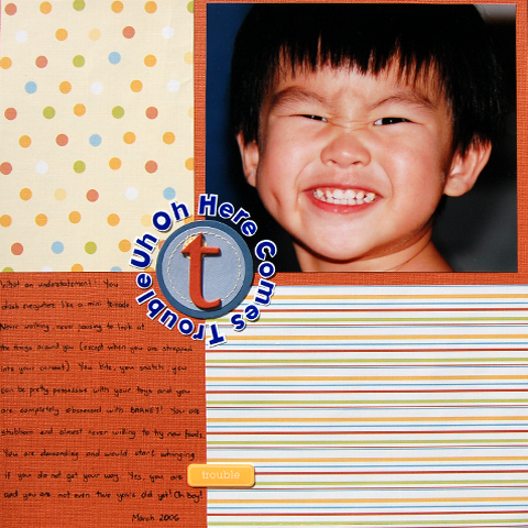
Hurrah more photos of my layouts. Hubby finally had time to take pictures of my layouts and i think the photo of this one has come out much better than the first one.
This placement of the paper and photo was inspired from a layout i saw in Simple Scrapbooks magazine (forgot what issue). This is one of my favourite layouts.


Materials: Textured cardstock: Bazzil Basics Paper; Patterned Paper, Stitched Tag: Chatterbox; Alphabet Chipboard: Heidi Swapp; Acrylic Paint, Word Tile and Alphabet Stickers: Making Memories.


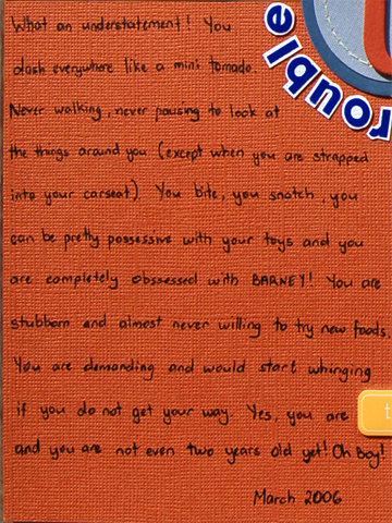
If you can even read my really bad handwriting...congratulations!! Personally i detest my handwriting and i've even bought a book by Heidi Swapp called Love Your Own Handwriting which has exercises in it. I have not had a chance to go through the book properly yet (as i have tons of scrapbook idea books and magazines to read) but one of the things that Heidi Swapp strongly advocates is the use of your own handwriting in your pages, regardless of how bad it is. One day, when i'm long gone, perhaps my great grand children will look at this page and yes they will probably say "Damn what ugly handwriting great grandma had" but at least they will know what my handwriting looks like. Hee.


The original journalling that i had drafted for this picture was about my hopes and dreams for Ty and how i hoped that he would follow his own personal dreams but my brother-in-law said that it did not match the cheekiness of Ty's photo. And how right he was!! Cheers JW. (By the way, i still have not found a photo to match my original journalling...meaning to say there are no angelic photos of Ty!! LOL)

The MM Alphabet Stickers were stuck on white cardstock and painstakingly cut out by hand with my trusty Precision Tip Cutter Bee Scissors in order to make them stand out more. I was lucky enough to find acrylic paint (Poppy) for my raw chipboard letter 't' that perfectly matched the cardstock.

Tip: The front of the page looks normal but turn the layout around and you'll find gaping holes behind the picture and patterned paper. I cut them out as no one looks at the backs of the layouts anyway and I get to keep the cutouts as scraps for diecutting, punches or even as mats for other photos.

NB: The photo of Ty was taken by Hubby in March 2006 with my brother's trusty Canon 10D.

Sunday, November 19, 2006

Layouts

When I started this blog, I just thought to make it an informative blog about scrapbooking in Brunei and the "trials and tribulations" that we Bruneian scrappers have to go thru in order to get supplies (well ok not so much of tribulations really...hee). But my brother mentioned to me that my blog was pretty un-interesting (in his words...boring...thanks Dude) as it contains no pictures at all.

Then on Saturday, at the grand opening of Shabby Chic, some friends of mine directed me to a blogspot called http://www.blessed2bestressed.blogspot.com/ and i was blown away. My orignal idea was to remain anonymous but now i realized that a scrapbooking blog should not be so and that i could do so much more with the blog. It was great fun to read Ruey's blog and Ruey, if you do come to Brunei as my friends have said you might, I would so love to meet you.

So now i have decided to change the objective of my blog. I'll still try and keep it as informative as possible but I will also try and upload my layouts (tho few they may be and so amateur-ish). I figure it will also be a good way for me to note down the materials used on the layouts and the story behind the layouts themselves. Who knows, i may use the same for a future layout on my scrapbooking.

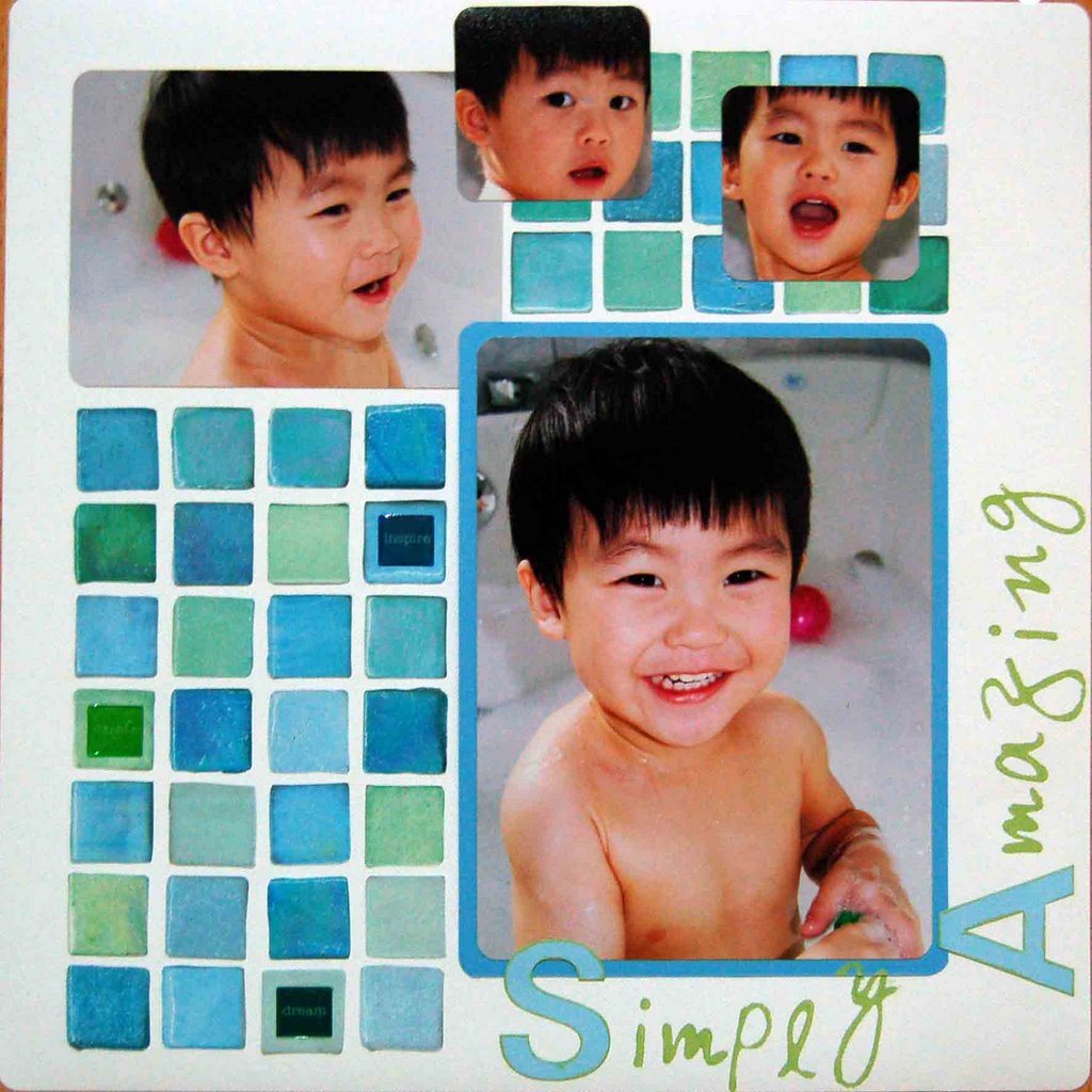
Now the only problem i have is that i do not own a scanner at home. Attached below is a trial run done by taking a digital photo of my layout "Simply Amazing". My brilliant hubby did it for me last night and i so love him for it!! Just so you all know, i'm simply hopeless with IT stuff.

And another big shout out to my hubby whose digital layouts have been uploaded onto the blog's main page. Hurrah!!


Materials: Textured Cardstock: Bazzil Basics Paper; Patterned paper: Flair Designs; Alphabet stickers, foam stamps and acrylic paint: Making Memories; Epoxy stickers: Plaid; Corner rounder punch.


This was a fun layout to do. The mosaic tile paper actually came in a 12x12 sheet (bought from Scrapping Gals). It didn't seem to work right by puting the entire paper on the layout so i decided to cut out the individual tiles (super easy with EK Sucess's Cutter Bee Scissors). I was going to hide the journaling about how much Ty loves bathtime, especially bubble baths, with a 'pull-out' behind the focal photo but my hubby liked it clean and simple as it was. So this was a rare layout for Ty with no journalling or captions at all. Photos were taken in March 2006 (we took tons of photos during that month cos we borrowed my brother's Canon 10D with a 1GB memory card and went absolutely crazy!! It also turns out that my hubby is a pretty good photographer).


So now my blog site looks completely different from when it first started. We have had to change the colours of the site in order to accentuate the layouts better. I think it's looking great and i can't wait to upload more stuff onto it.